Multidisciplinary Creative Director


Role: Creative Director, Head of Studio
The context:
In the highly traditional premium funding sector, two strong and established businesses—Hunter Premium Funding and Arteva Funding—operated successfully within their own markets.
Hunter was known for its trustworthiness, conservative approach, and client focus, with a bold, blocky blue identity. Arteva, by contrast, had a more flamboyant, tech-forward personality, using purple and orange to signal energy and innovation.
Following their unification under a single umbrella company, a new parent brand was required.
With a primarily HR-focus, this brand would:
• Act as the employer for all staff across both businesses
• Represent the collective excellence of the group
• Allow for future acquisitions without diluting the identities of existing brands
• Appeal to investors, employees, and industry stakeholders
Our challenge:
We were tasked with creating an entirely new brand, from name to strategy to visual identity.
The challenge was to create a brand identity that could balance Hunter’s conservative stability with Arteva’s bold innovation, while still standing apart from both.
The solution:
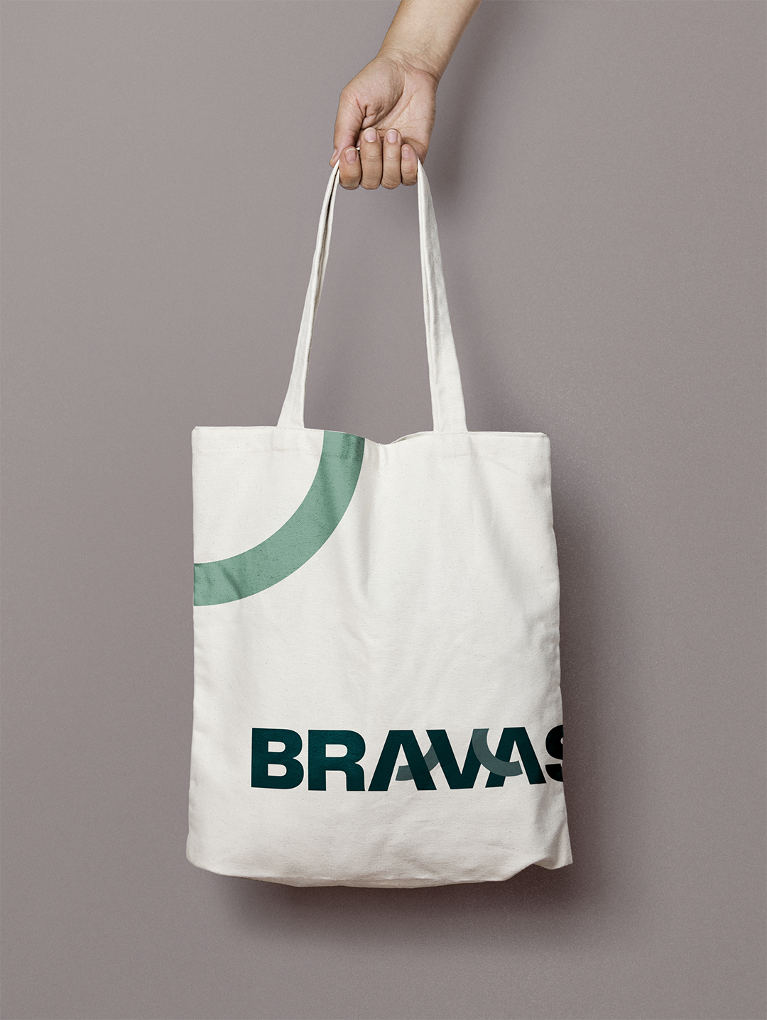
We developed Bravas—a name derived from the Italian brava, meaning excellence and bravery, and pluralised to suggest a collective of high-performing businesses.
Our brand positioning captured:
• Strength and stability through solid, blocky visual cues
• Innovation and progress through modern art direction, flowing lines and a forward-thinking tone
• Warmth and approachability through tone, design and colour choices
Having defined Bravas as the confident connector between group companies, embodying innovation in a traditional market, the logo design continued this messaging visually by creating a subtle curved link between the A, V and A in Bravas—representing progress and connection, the coming together of multiple companies, but also flow and fluidity, forward-thinking and collective strength.
The results:
The brand project came to life in record-breaking time
Tight briefings and solid communication allowed for a streamlined process, with aligned stakeholders providing consolidated feedback in just a single round. The company employed a democratic approach to the branding process, with a team vote deciding our ultimate brand direction.
Successful launch
Bravas launched as a confident, future-focused parent brand that employees feel proud to work under, investors trust, and partners respect. It bridges the gap between tradition and innovation, setting the stage for further growth in Australia’s premium funding sector.